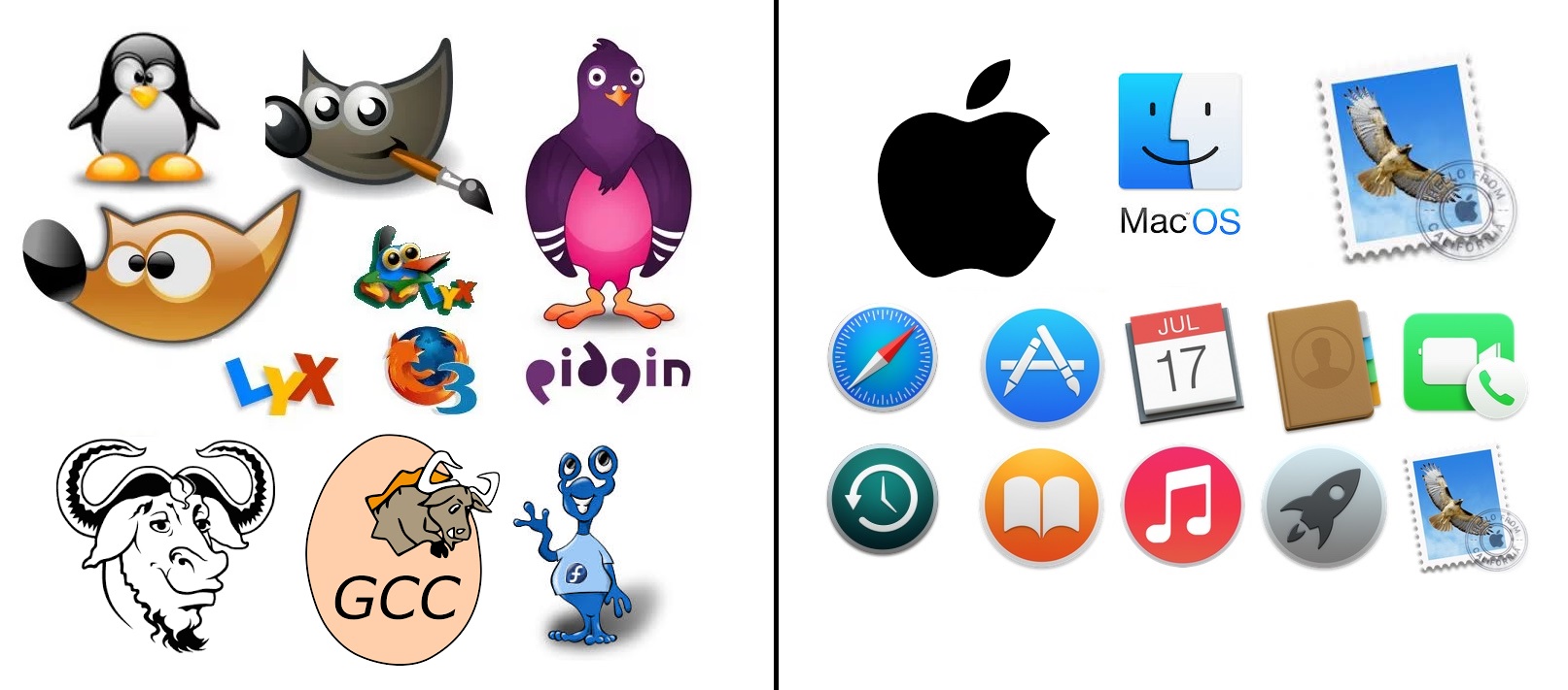
Finder, Safari and Mail icons are iconic symbols created a loong time ago and thankfully apple didn’t butcher them completely when they got modernized. The rest are generic, but very much in a specific Apple style of icon born with the OS X.
If you found a person who had never seen any of these. they could accurately guess what most of the icons on the right are for. And they could probably only guess gimp from the left.
Also, the apple side are app icons, while the FOSS side are a mix of icons/logos/mascots.
Icons don’t need “personality” as much as they need to be descriptive and useful. And for Apple default apps, they don’t need to be branded with a flashy mascot, because they aren’t trying to win your brand loyalty, you already are using macOS, so they already won.

The left are handmade and the right, a employee got promoted for getting some Getty Images licensed.
… what?
Finder, Safari and Mail icons are iconic symbols created a loong time ago and thankfully apple didn’t butcher them completely when they got modernized. The rest are generic, but very much in a specific Apple style of icon born with the OS X.
Still soulless af.
If you found a person who had never seen any of these. they could accurately guess what most of the icons on the right are for. And they could probably only guess gimp from the left.
Also, the apple side are app icons, while the FOSS side are a mix of icons/logos/mascots.
Icons don’t need “personality” as much as they need to be descriptive and useful. And for Apple default apps, they don’t need to be branded with a flashy mascot, because they aren’t trying to win your brand loyalty, you already are using macOS, so they already won.
Yeah thats what soulless is in this case. The monopoly and locking users into only buying things with a bitten off apple.
Apple probably googled for some just cartoon style and used the first thing.