I kinda miss the animated logos you would see in Netscape and Internet Explorer.
Wow
Now this is the real internet funeral
Popup:
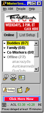
I don’t know why but I made it my new lock screen, thanks.
One example of explicitly learning why you don’t click on something when it says click here.
This looks way shittier than I remember it.
take me the fuck back
To waiting 3 minutes for a 178kb jpeg to load?
yep. fuck it.
but also no social media brainwashing, mass surveillance, and the like.
How did they manage to center the text???
<center> was a thing
Its not vertically centered, so probably with
<center><center>Tables and/or spacer gifs.
It was easy before CSS
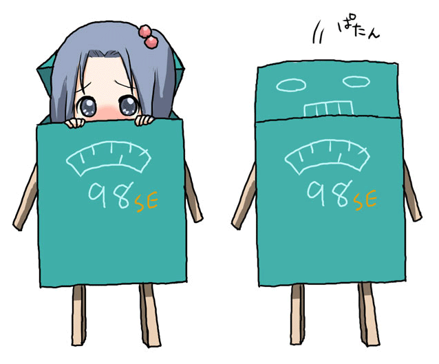
Os-tan!
Cheese actually contains a low dose opiate analog.
Cheddar is the opiate of the masses
Opiates actually just trigger the cheese receptors in the brain
Here’s a model recreation of the cheese molecule entering the cheese receptor
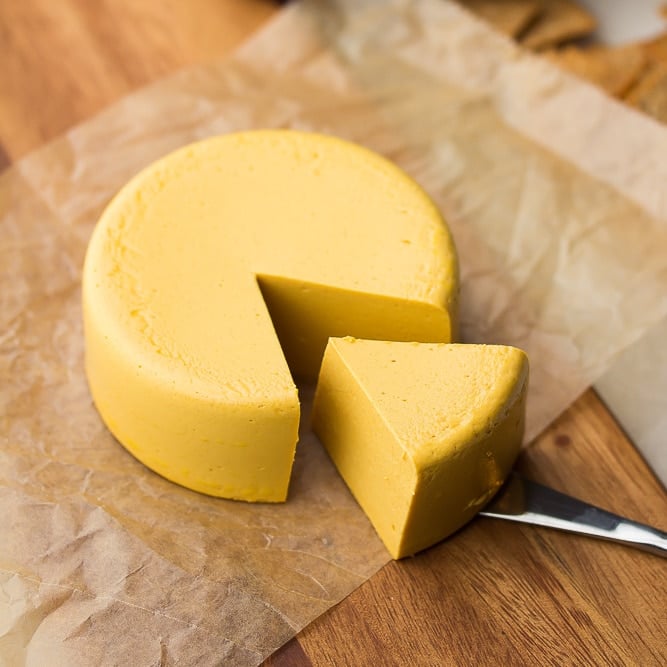
my entire body is a cheese receptor
you beat me to the punch
This is the ideal web design. You may not like it, but this is what peak performance looks like.
Pure HTML, untarnished by the poison of CSS and Javascript.
Not a javascript in sight. Just people enjoying their internet. And cheese.
00:44
When it was still possible to find the ends of the internet before 1 AM.
Dear god… no…
