Jerboa, probably just because I’m used to it
Voyager for iPad because is the exact same experience I had with Apollo for Reddit which was the best Reddit client back then. Boost for Android because, well, is the same as Boost for Reddit which was the best on Android :)
Voyager is the way. Only downside is that there is no notifications feature implemented yet.
I’m biased because I chat a lot with the developers, but I’d highly recommend Thunder - very sleek, very customizable, VERY nice compact mode, and a very welcoming group of people. If you try it and feel like something big is missing, they’re quite responsive on github! Been quite impressed with the leaps they’ve made with features on every release.
It does look quite nice, but sadly my long defunct keyboard app doesn’t work with Thunder, and they weren’t able to get the apk to test a fix for it. (But they did try.) You’d think, of all things, a keyboard and input field wouldn’t have compatibility issues, but I guess that’s Android for ya.
Oh, that’s a bummer :( what happens when you try to use it?

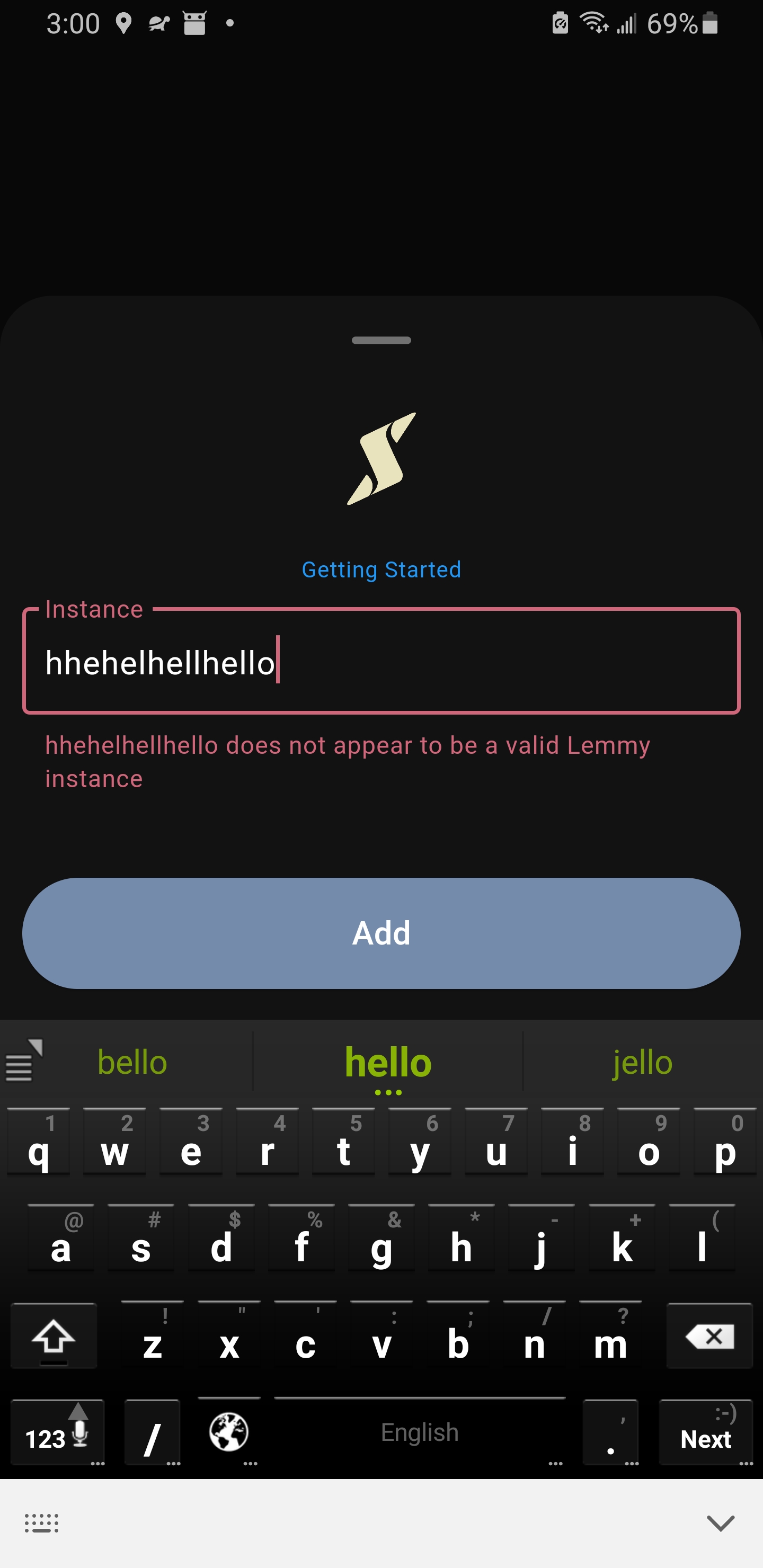
This is me typing “hello”, so it seems like it duplicates all the characters typed so far every time I add a character.
Aw man, that’s too bad :/ what keyboard is it?
It’s called Kii. You can still get a version from a 3rd party site since it hasn’t been on the play store for years.
I’m not sure how much I trust those apk sites, (so downloader beware!) but you can at least see the screenshots: https://www.apk4fun.com/apps/com.zl.inputmethod.latin/
I don’t think it’s anything earth shattering, but it’s kinda nice, and fairly minimal, and it’s what I’m used to, so I’m happy with it.
Have you tried other options like AnySoftKeyboard or HeliBoard (fork of OpenBoard)
I’m pretty sure you’ll like AnySoftKeyboard, it’s pretty minimal and similar to your current keyboard. And it works with Thunder.
You can still submit a bug report for Thunder not working with Kii, I’m pretty sure the Thunder devs would be willing to fix this.
Me old man, me yell at cloud. Change bad.
Thanks, though, I’ll take a look at them. (:
I did submit a bug report, but the dev didn’t seem interested in getting the apk for testing. I can’t say I blame them. Apk sites are a little sketchy, and it’s also probably not a bug that’ll affect many other people.
I second Thunder. Only a few minor gripes from me but switching from sync (gross ads) has been just fine
Thunder is a great mix of functions and UI. The compact mode is really great.
Man I’ve been using Voyager since the beginning after switching off jerboa but all these thunder comments are making me want to try it out!
Give it a shot! Definitely check the settings if you do, the tweakability is fairly expensive - and if anything feels missing let the team know on GitHub!
I’d use Thunder more if they had mark as read while scroll, and hide read posts (I think they already have the later) if these requests are outdated please lemme know.
“dismiss read” is an option you can add to the FAB, and mark as read on scroll looks to be a setting now as well! Haven’t used either, but hope they meet your expectations :)
In settings , you can toggle on mark as read on scroll and hide read .
Yup. I’ve configured my thunder to look and feel really similar to the way I had Relay set up. The compact modenis great and the customizability is really good.
Jerboa. Because it works alright, it’s open source and it’s the Lemmy team’s app.
Voyager. It economizes on screen real estate, and has similar (therefore, familiar to me) ergonomics as Relay did back at the old place.
Tight design that stays out of the way, and updates frequently.
Connect. I came from Sync for Reddit and Connect has that nice clean layout that others lack as well as nice, simple swipey gestures.
I’ve tried pretty much all of the others ones (at least those that existed up to 3-4 months ago) and I keep coming back to Connect.
Is there a reason you still don’t use Sync?
Reddit and Lemmy have a few different nuances that Sync doesn’t properly address. A good example is blocking communities or individuals right from the post menu. Syncs development has been sporadic or at least was when I paid attention. In addition Connect has a few additional features like “hide all above” which is a nice feature to have once you get used to it.
Oh! Neat. Yeah, I’m glad I stumbled upon this thread, because I also felt like Sync hardly updated and I’m trying Connect and Thunder out now and I feel like I’m experiencing Lemmy in a whole new way. I feel bad for the guy behind Sync cause I know he put in a lot of work for the Reddit client.
Thunder
Racoon for Lemmy still have some rough edges, but is really cool and nice looking.
Second this. I have had some weird freezes with the recent thunder updates so I installed raccoon. It’s not as feature-packed as thunder but you can set up enough UN’s it’s really nice looking.
Eternity for lemmy is peak user experience imo
Is Eternity still in development? I don’t think there has been a release for 6+ months.
No. The last commit made by the developer was 4 months ago https://github.com/Bazsalanszky/Eternity/commits/master/?author=Bazsalanszky
Boost, boost have always been my favorite, on Reddit and now Lemmy. Cant say more then i just like it, and like the developer
Boost here as well, was a RIF user and I’ve been able to make boost look and feel sorta like RIF which is great.
Yeah, rif was my absolute favourite, and I miss a lot of the features it had. I’ve been toying with the idea of cloning it for Lemmy, but maybe I’ll give boost a try first.
Give boost a shot, nothing will replace RIF but boost is pretty damn close.
I also use Boost because of one nice feature: it highlights new comments in a different color.
I had to turn that feature on in the settings, and it’s very convenient when revisiting an active post.
Jerboa
Its simple and lightweight. Can optionally get it on the app store if you want.
I use Connect, and I have no complaints.
Tried Jerboa early on, but at the time it was super buggy. Hopefully it’s better now - I feel like a FOSS app is a way better option for Lemmy just on principle.
The ol boosteroo! Nice and simple.
Connect.
I like to have posts and comments as small as possible, without large pictures being downloaded before I click the post, and it must have a dark mode.
I also tried Jerboa and Voyager, and while they’re also customizable, I couldn’t get it exactly right. Maybe it’s possible now, but I can’t be bothered to keep up to date on three apps when Connect does it just fine.
I’m not sure what any of them look like by default. I basically set out to recreate the way I used RiF for Reddit, which also wasn’t the default.
I’ve been using Jerboa for that reason. Condensed information so I’m not constantly scrolling.
What’s Connect look like for you?

Posts:

Might be a hold over from Reddit is Fun but I can’t say I’m keen on the way the voting is displayed there. Seems to take up too much real estate maybe?
Either way, I’m not a fan of colouring certain text or the lines dividing each post. Both these things make is too busy for my taste.
Then again, maybe I’m just bland.
Here’s what posts look like in my compact configuration of Jerboa:

I haven’t used Jerboa in ages because of how buggy it was in the beginning, but that looks very pleasing to me as well. So many of the apps out there just look too “busy” for me. I am also coming from Reddit is Fun, so I like as simplistic looking an app as possible. Voyager fills that role for me and fixed the bugginess issues I had with Jerboa.
I’m sure Jerboa is much more stable now, but I just haven’t had a reason to leave Voyager yet.
A big difference I find is having the separations be padding and not a line. Even if each option took up the same number of pixels, the line makes it too visually crowded.
I’ll give Voyager a go and see how it is.


