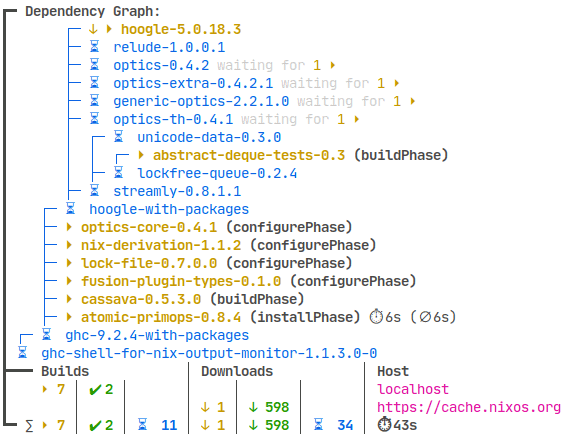
Nix with nix-output-monitor (nom). https://github.com/maralorn/nix-output-monitor

It shows the tree of packages to download and to build. It shortens the tree in realtime when packages have finished downloading/building and lengthens the tree when it finds more packages it needs to handle. Very fun and satisfying.
I haven’t seen this in other package managers.
ArchLinux’s pacman with ILoveCandy option enabled.
Ouu, you have me intrigued! Would you mind sharing a screenshot of what that would look like? Never tried pacman, nor heard of ILoveCandy.

The “C” in the progress bar is alternating between “c” and “C” to give the impression of munching.
TIL EndeavourOS enabled that by default. I always thought it was standard…
I still love aptitude TUI even though I don’t use Debian anymore.
Next is dnf because it’s clear with obvious subcommands.
Nala (an apt frontend) is the best I’ve seen so far
pikaur? I love all the colors, especially the bit where it highlights the differences in major/minor version numbers, so it immediately catches your eye (so you can track major package upgrades). I also like that it should which packages are being pulled in as new dependencies.
I really like the simplicity and formatting of stock pacman. It’s not super colorful but it’s fast and gives you all of the info you need. yay (or paru if you’re a hipster) is the icing on top.
portage is pretty when i dont mess up my USE flags
I really like emerge/portage, even w/out the “candy” feature enabled. Great color highlighting, and verbose messages about any config change(s) needed.
Nala
Aptitude
Pacman ofc
I use apt-get, I don’t care about how “pleasing” the package manager is, I just want it to do its job and get off the way… But pacman… I don’t know why, but it’s so beautiful, charming and cute, how do they do it?
exactly. They use
candC(uppercase) alternatively, making it look like pacman is eating. hence the beautiful, charming, and cute progress indicatorbtw dont think im crazy but ive set max parallel downloads to 200 and when i do a system update, damn that looks so good.
You can have actual Pacman emoji for the progress :)
How?
Sorry for the late reply, look for ILoveCandy option in the config.
Debian made me to only love apt and dpkg.
Omg apt is like the worst UI there is.
Have a look at nala! It needs some depencies but is a huge upgrade
Ah ah i will one day.
I clearly agree, apt is ugly and even synaptic making it better. But like i said, while ago when I used synaptic I did break my packages and I got to use dpkg and apt, to repair.
Since, I guess, I’m on a PTSD about it and now just use apt or dpkg, when using a Debian or Debian based system.
But I will listen to you, and for sure will give it a try
Nala is an apt wrapper, it just displays stuff better, automates updates and automatically chooses the fastest mirror (thats the stuff I know)


