What should I add to my '90s website?
So I’m currently toying around with NeoCities, and decided to trial it by building your classic mid '90s Geocities/Tripod/Angelfire pastiche website.
Some of the most important elements are already in place.
Tile background? Large font? Heading in bright pink with a shadow? Unusual colour choices? Random cat gifs? Under construction gif? Check! Check! Check!
In the true spirit of the '90s DIY web, some more pages (including the links page) are coming soon.
(I’m thinking of adding a page dedicated to either Britney or a nu-metal band.)
You can see the page so far here: https://that90ssite.neocities.org/
There are a few things that I want to add to make it complete, and I’m looking for suggestions.
The first, is to embed a midi file that plays automatically. Any suggestions on the best way of doing this?
Second, it’s just not going to be complete without a guestbook.
Third, any webring suggestions?
Fourth, what’s the best way of adding a java chat room in 2024?
Finally, anything else that really needs to be a part of a great '90s website?
@ajsadauskas @neil @asklemmy Looks amazing!
My only question is about whether drop shadows on text was prominent. I’m having trouble remembering how that effect would have been accomplished in the 90s, since I don’t think CSS got it until later. Would it have been something on the <font> tag only supported in Internet Explorer?
I love it! Takes me right back. I was going to suggest adding a visitor counter but you already had it.
The problem is the MIDI file doesn’t automatically play.
Guestbook, hit counter, a midi file playing in the background, and a dead hyperlink to another page of the same website.
Edit: omg I can’t believe I forgot about marquees. Do that too.
there is a website for a pizza place in seattle whose website does this, maybe you can get some inspiration. dinos
Seems like it’s missing one of those section break bars that’s an animated rainbow
Needs more dancing Jesus
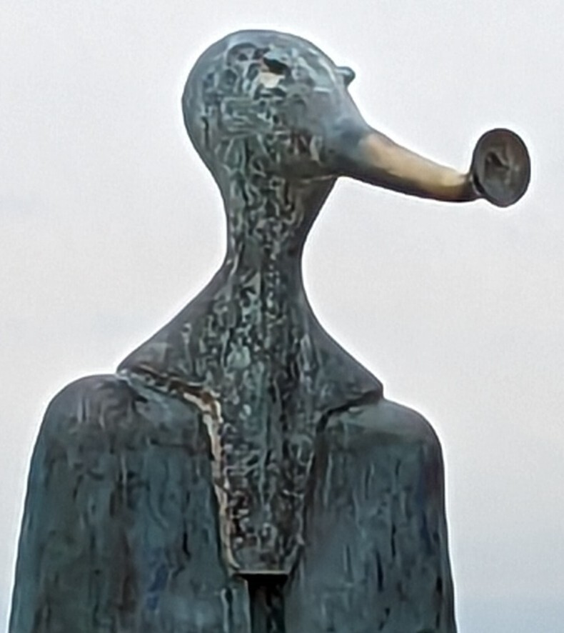
Needs 300% more skull trumpet.
My favorite version of the skull trumpet: Makes a man go doot doot
Here is an alternative Piped link(s):
Piped is a privacy-respecting open-source alternative frontend to YouTube.
I’m open-source; check me out at GitHub.
For the authentic experience, you need two versions of the site: An Internet Explorer version, and a Netscape version. The two browsers didn’t support the same features back then, so a lot of sites would have two different versions.
Also run it on your own server and limit the transfer speed (can set a rate limit in the Nginx config) so it loads slowly :D
It’s readable on mobile. You need to unfix that immediately. The font must not appear bigger than 5px. Responsive layout is forbidden.
Also, no popups, That’s both retro and not retro enough. (Or were those introduced for the first round in the early 2000’s? I don’t know, I’m too young)
do you have a click counter at the bottom
Your text is too readable, I think it needs to be aliased a lot more. It also wasn’t uncommon to see a black box around text. Your text looks good on the background, it shouldn’t. There should be something between the text and background.
You need some “important” data that’s in an unstyled bulky table. You also need some horizontal rules on the page to split up content.
Absolutely needs a hit counter.
Not one person suggested a marquee. Wow.
Granted, the HTML tag is deprecated in the spec, but you can easily set up a marquee using CSS.


