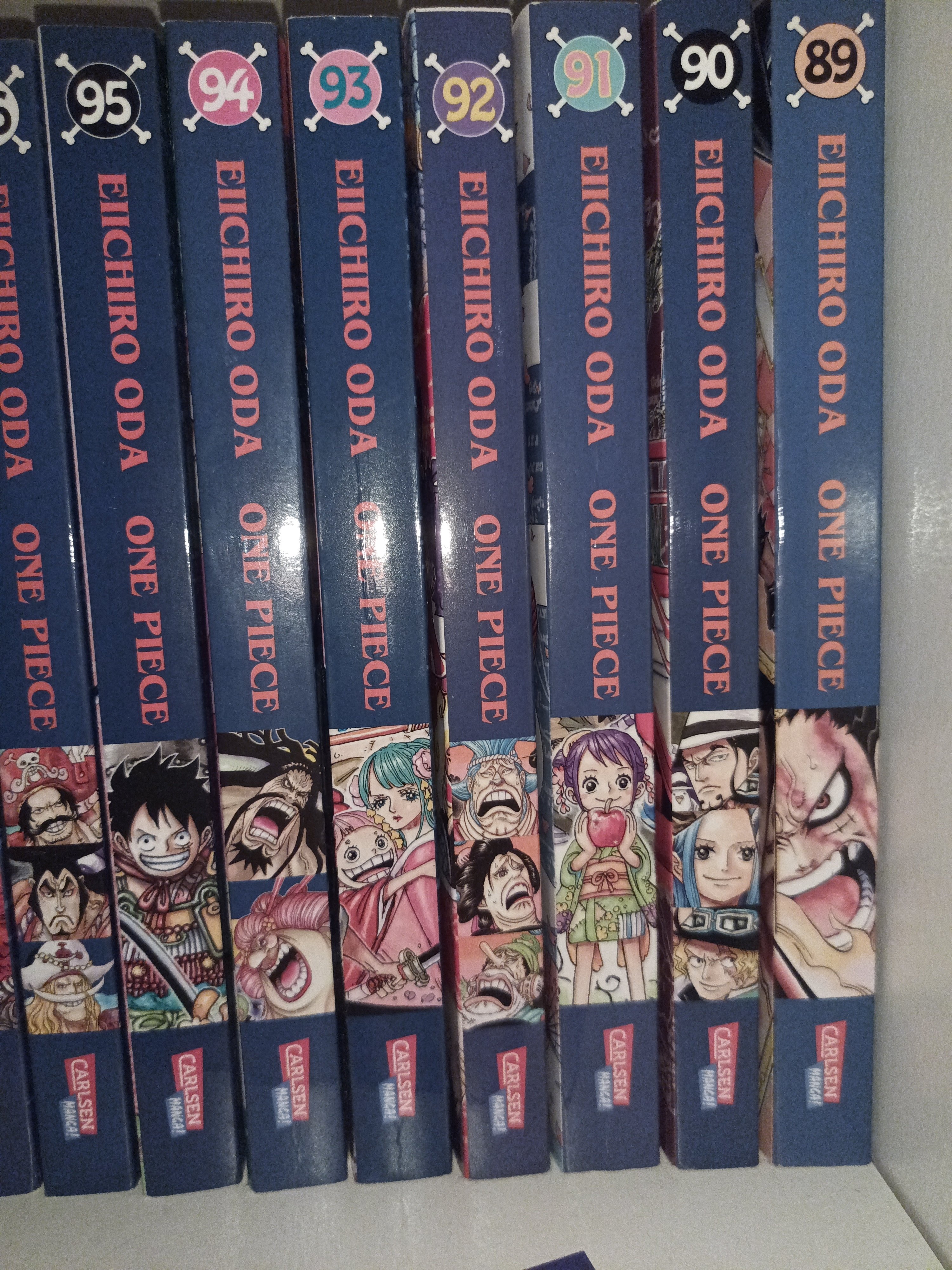
I mean you could say, Volume 1 is 23 years old, but even newer ones won’t often get it right …
5-9 need immediate re-issues.
unforgivable
 92 as well :(
Some manga publishers just want to watch the world burn
It amuses me that One Piece comes in so many pieces
Do you actually want the OnePiece All-in-One version?
Because it would look like this (yes, it’s real):

I’m no manga expert but wouldn’t a one piece One Piece be a lot bigger than that?
This is just Part 1 of 100 :)
find the offset for the misaligned ones and 3d print a riser to place under them.
Yeah but then the tops would sit higher
Volume 8 aligns well with the text and the number at the top but the picture doesn’t , so it wouldn’t help :( But thanks for the idea!
Would book jackets work?
Yeah…. Manga is pretty infuriating.
It could be cool if they made a wave or something with it. Now it just frustrating.
Scanners, picture editors and colour printers have been a thing for quite a while now, what’s stopping anyone fixing it for themselves?
Probably bait but: Replacing a book cover is not a beginners task. A printer capable of doing book covers without looking like shit isn’t a household size item or household price and the printed result is different from the source image. Even if you scan the book at the highest resolution you will get the print pattern and not the pixels. Editing will be a shit show if there is a noticeable pattern in the print. Basically guaranteed to look like garbage if you don’t put an exorbitant amount of time in. Or if you have a book printing business but then the copyright lawyers will come for your first born.
What the… do they not use templates for their designs of the covers?
Even Berserk Deluxe editions suffer from the same sometimes
This could be a case of them cutting multiple covers at once.
I had the same problem with jeans. I order the exact same style and size, but they don’t all fit the same. When I spoke to a Levi customer service person, they said they have multiple layers of fabric piled on top. Then the cutting blade presses down, and the fabric bends. As the top one is to short on measurements, the bottom most one is to long. So you want one in the middle.
I know paper isn’t fabric, but it could be something similar. It’s speed and efficiency over accuracy.
Maybe after a few hundred volumes of One Piece you’ll be able to play it like sheet music.
100% done on purpose just to trigger people who notice.
Yeah my Tanya the evil book collection suffers from this too.
Sometimes the publisher changes the logo in ways that break the look too.
Really old Tokyopop releases had a small logo, and newer printings have a big red bar at the top-- even within the same series.
Things like this are more than just mildly infuriating to me as a collector. To help all of us calm down after the shock and also to redeem Carlsen Comics, at least a little bit, I present to you my Akira “Original Edition” also known as the “Phone book Edition”. The layout of the issues is not accurate to the millimeter but the production tolerance is definitely precise enough to feel fine about it.

Damn that looks about as ancient as my dad but still more uniform and tidy.
an attempt was made, vs “eh print it, who cares”


