lmftfy
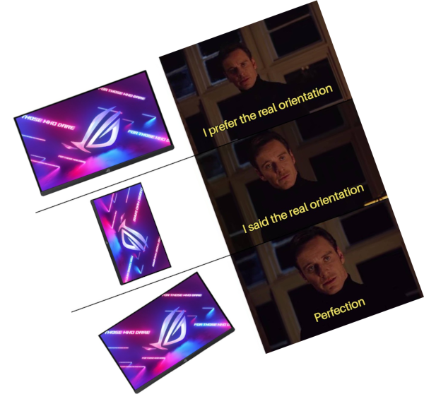
I’m just sitting here patiently waiting for hexagonal displays.
If we could get edge-to-edge displays, hexagonal panels with a spherical radius will be the next big thing for battle stations.
(By spherical, I mean its curved so it can be tiled into a sphere.)
Let’s go one step further and build a monitor orb with a chair in the center.
I mean, yes. That’s what I was getting at.
something like this:
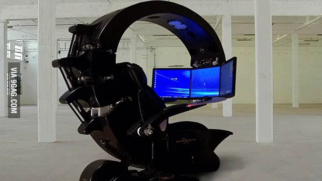
but better.
I’ve got two vertical monitors on either side of my one large horizontal monitor right now and I am loving it
The 'ol tie fighter layout, nice
The steam deck does have a gyroscope for sensing rotation… Just saying.
That feature has always been annoying to me, even on phones. I always turn it off because “I” will control whether my screen rotates or not. Maybe sometimes I don’t want it to rotate when I turn the phone (like when I’m viewing building plans at work and want to orient the screen with how I’m looking at the building I’m standing in).
Not sure how standard this is, but on Pixel phones the default is no auto rotation, but when the phone detects rotation it will display a tiny rotate button in the corner of the screen for just a few seconds. Best of both worlds IMO.
My android does that too, but some apps ignore it and it’s extremely annoying, especially when lying in bed (looking at you, Sleep for Android)
That’s a stock Android feature, or at least it’s on Motorola phones. Handy button.
That rotate button is incredibly annoying. I turned off auto-rotate for a reason and the button obscures other information displayed in that corner of the screen. Wish I could turn the button off too.
What information is in your navigation bar?
What navbar?
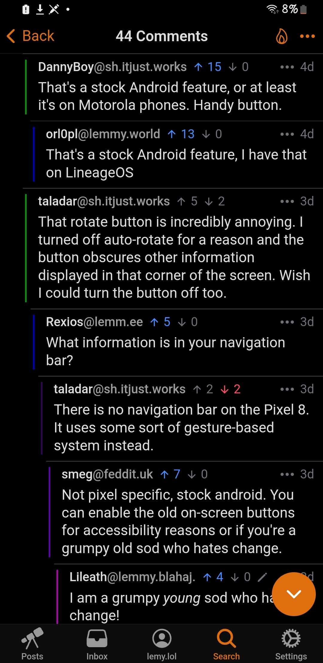
There is no navigation bar on the Pixel 8. It uses some sort of gesture-based system instead.
Not pixel specific, stock android. You can enable the old on-screen buttons for accessibility reasons or if you’re a grumpy old sod who hates change.
I am a grumpy young sod who hates change!
It’s still a navigation bar it’s just transparent. If there’s important information down there that can get blocked by it then the developers of the app did something wrong.
It is simply the bottom of the app window. There is nothing app-specific to this behaviour, lots of apps show information in the lower 20-30 pixels of their window.
Give me a stabilized image on a spinning display.
-22° so cool
Finally, I can calmly watch the performance of my stock portfolio
Is someone already working on a trapezoid desktop environment?
This truly is the landlord tipping of linux memes


