- cross-posted to:
- fediverse@lemmy.ml
- cross-posted to:
- fediverse@lemmy.ml
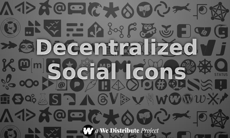
As we’ve been building out our site, we’ve wanted to showcase the icons of various projects and protocols. However, there’s been a real lack of any kind of icon font for that purpose…Mastodon is pretty much the only Fediverse project to be featured in FontAwesome, and the ForkAwesome project has been dormant for a long time.
So, we’ve been building our own.


Can I ask seriously why the hraka do icons have to be a font? *.png has existed since… well, almost since before I existed. Not to mention stuff like CSS imagegrids.
Pretty much everywhere I go and open a webpage, I’m first met with text symbols that are something like “Á” or “§” and I can’t figure out what are they for unless I hovertext over them and the link says something like “sign up” or “join our Discord”… then I realize that, sure thing, the site relies on a remote connection to fontawesome to even display their menus correctly. Of course since I use uBO, I have remote resource connections disabled unless they’re needed ones.
If anything, I’m at least pleased that these are not huge ass-SVG banners that are like 4 to 6 screen tall bird or globe icons that a remote javascript is supposed to redraw as social icons of an adequate, small size. But at least one thing that is good about using images is that they have an accessible fallback: the
altattribute, or thetitleif you are lazy. To my knowledge, fonts don’t have such an accessible fallback on HTML.Interesting insights!
The original reason we started this was actually for our own development. Our site includes project icons and colors in dedicated tags, which link to dedicated topic hubs. As we started working on this, we realized that there wasn’t a really good resource, and that we would have to build something from scratch.
Those symbols that you see are typically Unicode. Icon fonts are generally a CSS hack, in that a collection of SVGs have been converted into a font. The Unicode strings can be thought of as “letters” for that font. You’re absolutely right that there are accessibility limitations, but the tradeoff is that people get an easy way to use their favorite project icons to represent where they are on the Web.
At the very least, you won’t have any uBO problems with our site, as the font is incorporated directly into the theme we’re using. We’ll likely explore making a WordPress plugin next, so people can add these to their profiles and menus and other places.
Thanks for the response! It makes sense that you’d have to build stuff from scratch if you could not reasonably find something somewhere else that “fits”. A good work on hosting that extra tidbit yourself, too.
Has this impacted your decision process on how to iterate this over time? I assume at some point there will be more or different projects going around, some projects may die but their archives might still be around, who (if anyone) counts as the authoritative voice on how a given project’s icon should look, etc.