You must log in or register to comment.
That font is fucking atrocious.
not a man of culture, i see
Nah, I’m uncultured swine.
that’s cool.
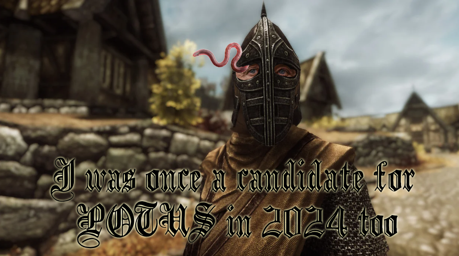
Edit: the reason for the font choice was because it fits the motif. Also, it draws the eyes in to see other details, which is needed because rfk’s eyes are the only identifying feature (worm excluded). The standard impact doesn’t yield the same results if the key elements are tiny in the image
That font is a brain worm simulator.
OP should have used comic sans.
The Jarl would have had my head or tried to put an illithid in it

