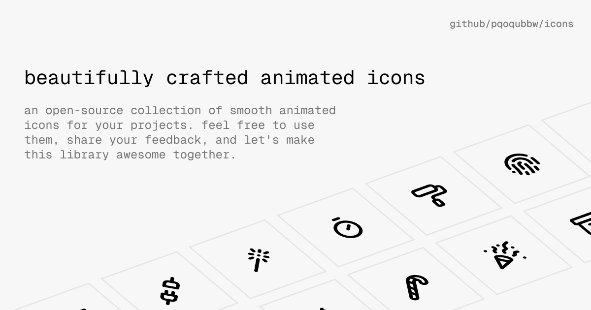
a lot of these are terrible, made by an animator who doesn’t understand design and just wants to make lines move for the heck of it.
Since you hold a strong opinion on the quality, can you give an example of an animated icon pack which keeps to good design standards?
nope!
i agree these arent wonderful but i also like the idea in general and wouldnt want amazing icons to steal attention from the actual app functions anyway
They made me want to click each of them. So am I allowed to consider them nice, or is your “professional” opinion going to be the judgement of that?
if you have to ask me for “permission” for having your own opinions, well, i won’t stop you.
No, I am essentially asking why they suck if a common user, such as me, likes them. Seems they fulfilled their purpose?
Then that is your opinion and you are entitled to it.
I do not like them because the animations are arbitrary, with no proper theme and consistency to how they work and what they actually represent.
I know I am. I am also entitled to challenge your notion of “this is terrible” that is not really constructive to
I do not like them because the animations are arbitrary, with no proper theme and consistency to how they work and what they actually represent.
This is actually informative.
This is not open source? There is no license just a statement saying free to use for personal and commercial projects, but don’t redistribute or resell.
This freeware at best but if you contribute to this project it’s not clear who owns the work.
Shame they didn’t use a proper license when publishing.
They have a proper license now: https://github.com/pqoqubbw/icons/commit/0ae3fe52047e9c8fa326beb09b446e062019d03e
Kudos to the devs quick turn around.
There is an active issue with reccos. Hopefully it changes.
Update: A license was added
Nice! And MIT too. Perfect; I’ve given it a star now.
So basically don’t use this in anything commercial because the phrase “feel free” is different to legally libre and gratis. I personally wouldn’t touch this until it’s released under a reputable license.
I wouldn’t assume this is done with malice in mind, but maybe this is someone unaware of the importance of a formal license.
I agree. I don’t have the time but someone should point this out to the dev via an issue on GitHub.
Someone did in the mean time: https://github.com/pqoqubbw/icons/issues/4
Its been resolved, the project has an MIT license now
Why are these TypeScript + JSX rather than just SVGs? It seems that the paths are defined as SVG but they are using some JavaScript framework to define the animations rather than just using SVG or CSS animations.
It’s jsx which is framework agnostic and used in several frameworks but most closely associated with react. It’s easy to convert to html but I guess the author is a react dev and also these icons use framer-motion which is a react animation library to animate the cursor hover. Looks like you can strip those out if you wanted to use these icons in html without animations.
is framework agnostic
But it isn’t, because they depend on framer-motion and React. JSX is, but the icons aren’t.
You can trivially provide on-hover animations using CSS in SVG then your icons are framework agnostic. Not to mention smaller to download and more efficient to execute.
Because they’re using events and downloading a few megabytes of extra javascript framework is, of course, a way better option than six lines of SVG stylesheets.
Edit: forgot a /s
These should be called: Boops.


